BDCP Visual Identity System & Brand Refresh

BDCP Visual Identity System & Brand Refresh

I developed a comprehensive brand refresh for the Best-Designed Campus Papers of the Philippines (BDCP) to modernize its visual presence and better appeal to a young, digital-native audience. The core challenge was to create a flexible identity system that could house various product lines—including the annual Awards, the Magazine, and the "Revolt!" webinar series—without losing brand cohesion. The solution features a custom geometric logomark formed by the acronym "bdcp," utilizing a vibrant red-to-orange gradient to symbolize the energy and passion of student journalism. This visual language extends across the sub-brands, ensuring that distinct deliverables like the Revolt! webinars remain visually connected to the parent brand through typography and color theory.

I developed a comprehensive brand refresh for the Best-Designed Campus Papers of the Philippines (BDCP) to modernize its visual presence and better appeal to a young, digital-native audience. The core challenge was to create a flexible identity system that could house various product lines—including the annual Awards, the Magazine, and the "Revolt!" webinar series—without losing brand cohesion. The solution features a custom geometric logomark formed by the acronym "bdcp," utilizing a vibrant red-to-orange gradient to symbolize the energy and passion of student journalism. This visual language extends across the sub-brands, ensuring that distinct deliverables like the Revolt! webinars remain visually connected to the parent brand through typography and color theory.

Category

Category

Branding, Brand Architecture

Branding, Brand Architecture

Services

Services

Branding

Branding

Client

Client

BDCP

BDCP

Year

Year

2020

2020

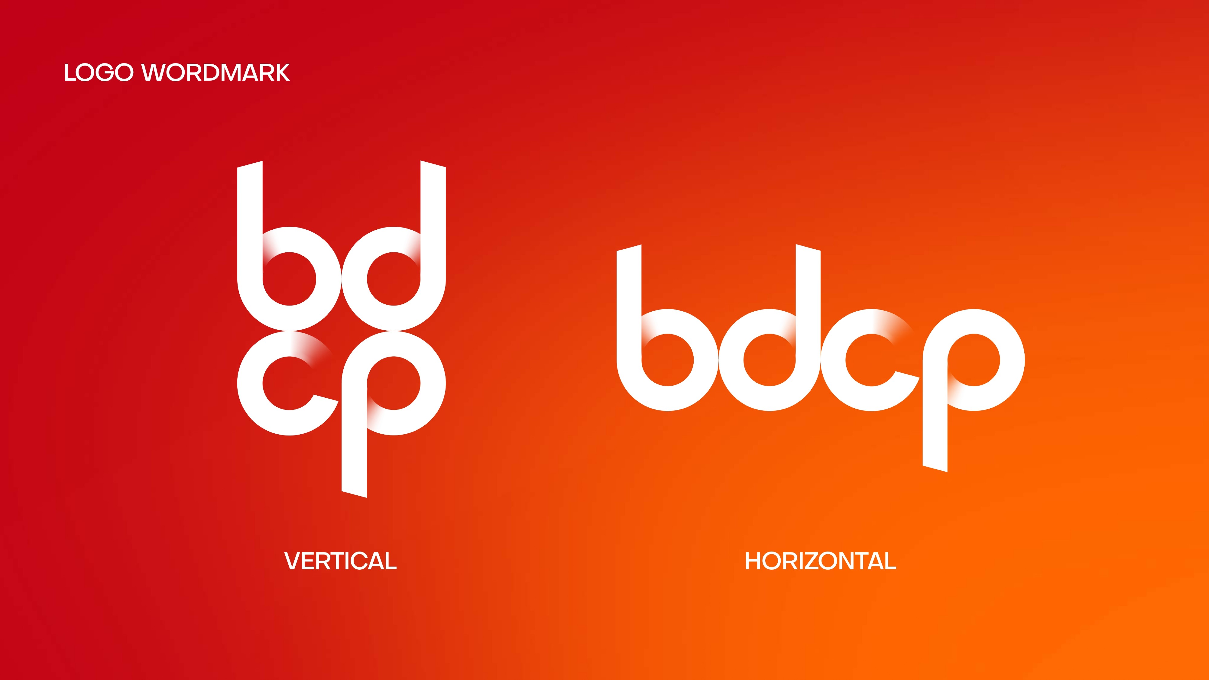
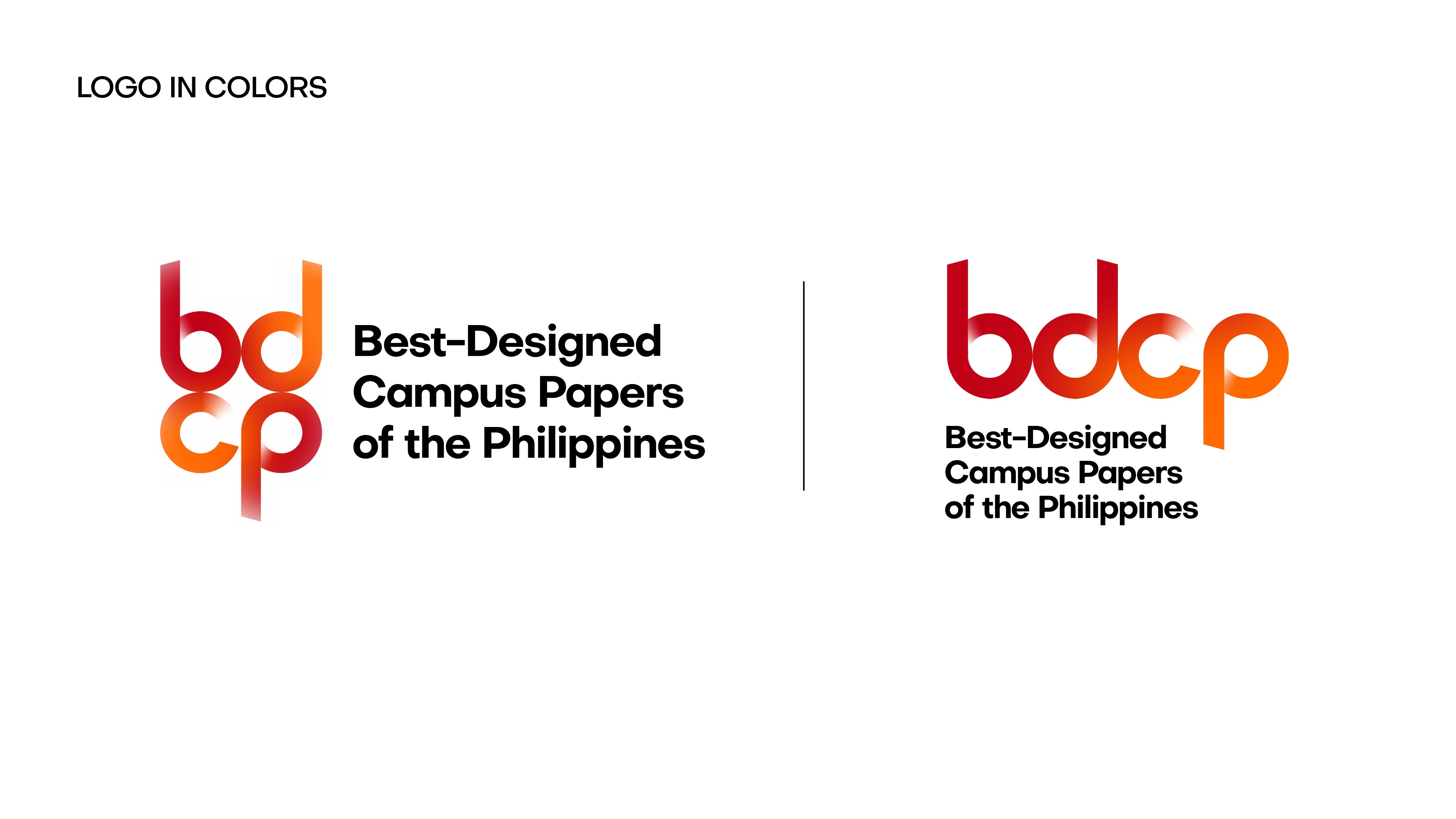
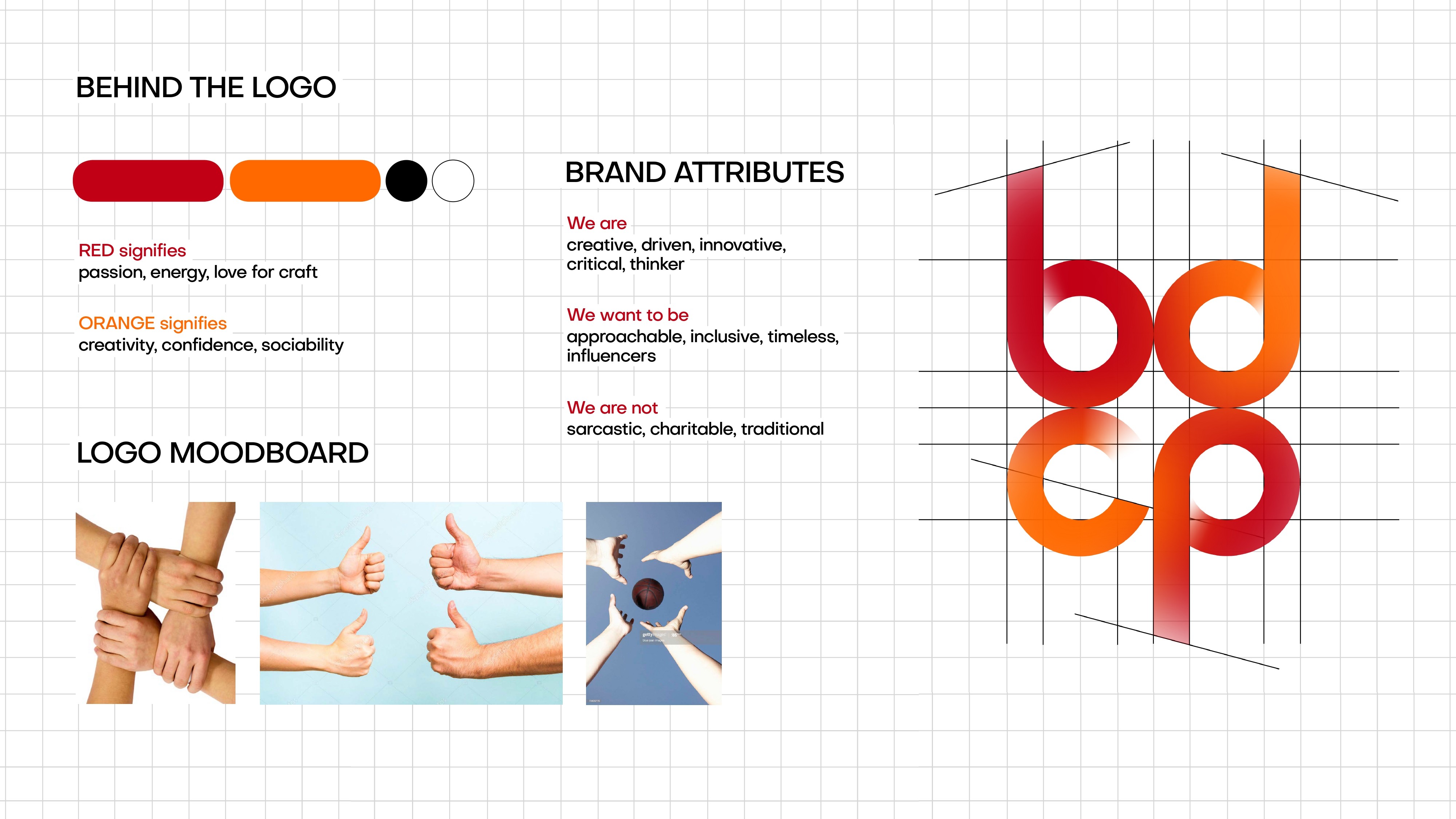
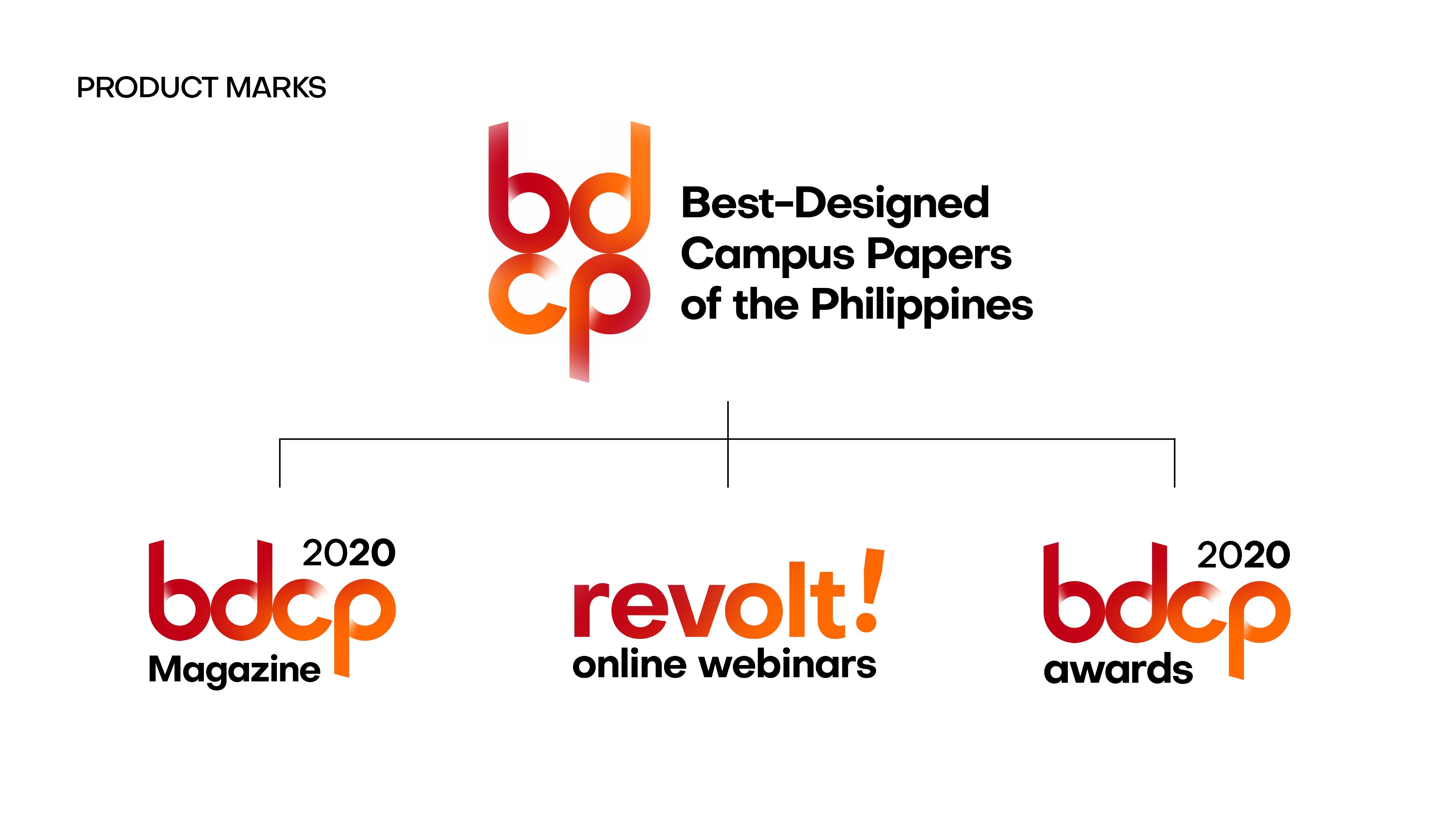
Visual Strategy: Designed a 2x2 geometric monogram that serves as a bold, recognizable parent mark.

Brand Architecture: Established a cohesive hierarchy for sub-brands (Magazine, Awards, and Webinars), ensuring consistency while allowing for specific product differentiation.

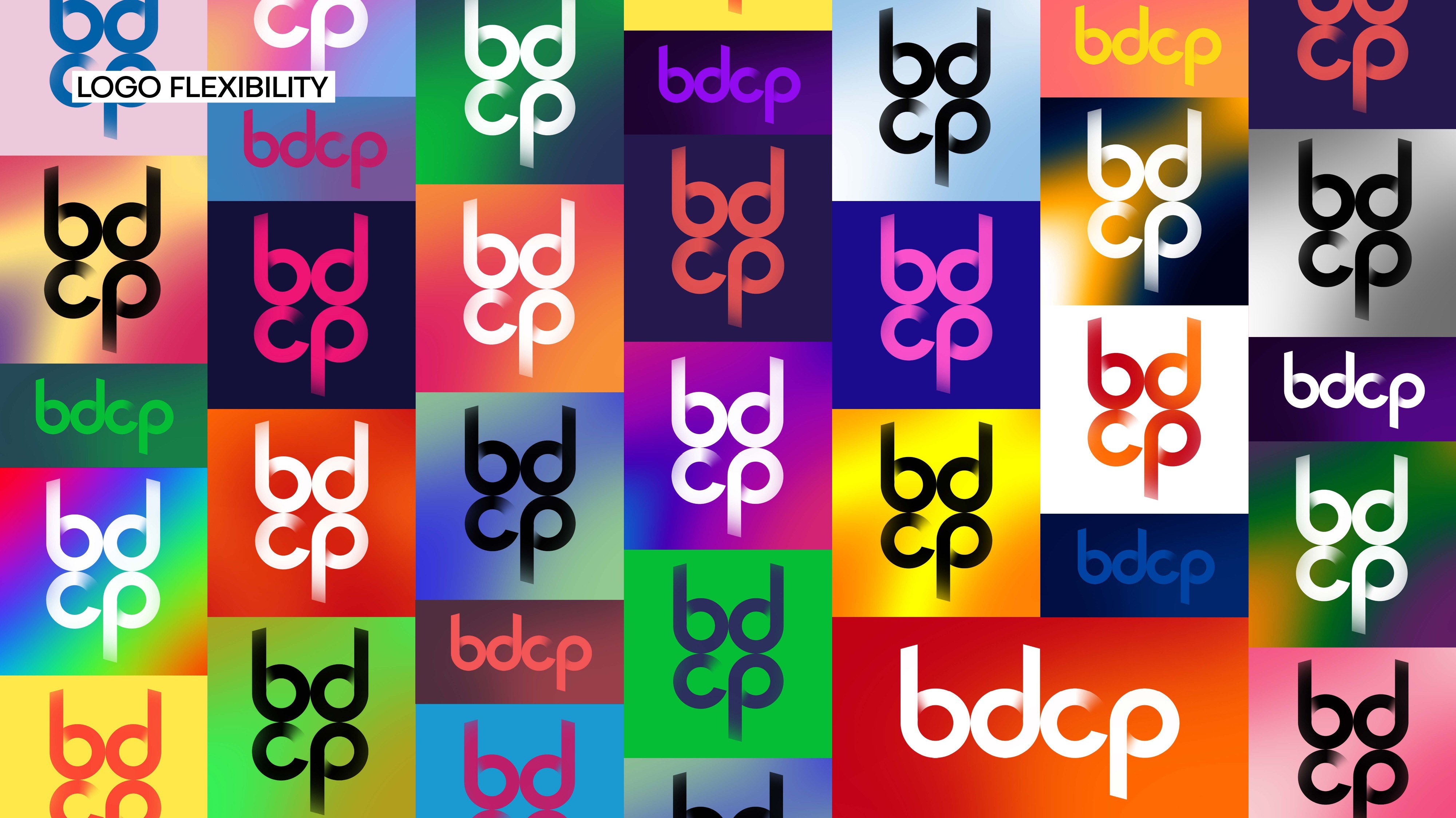
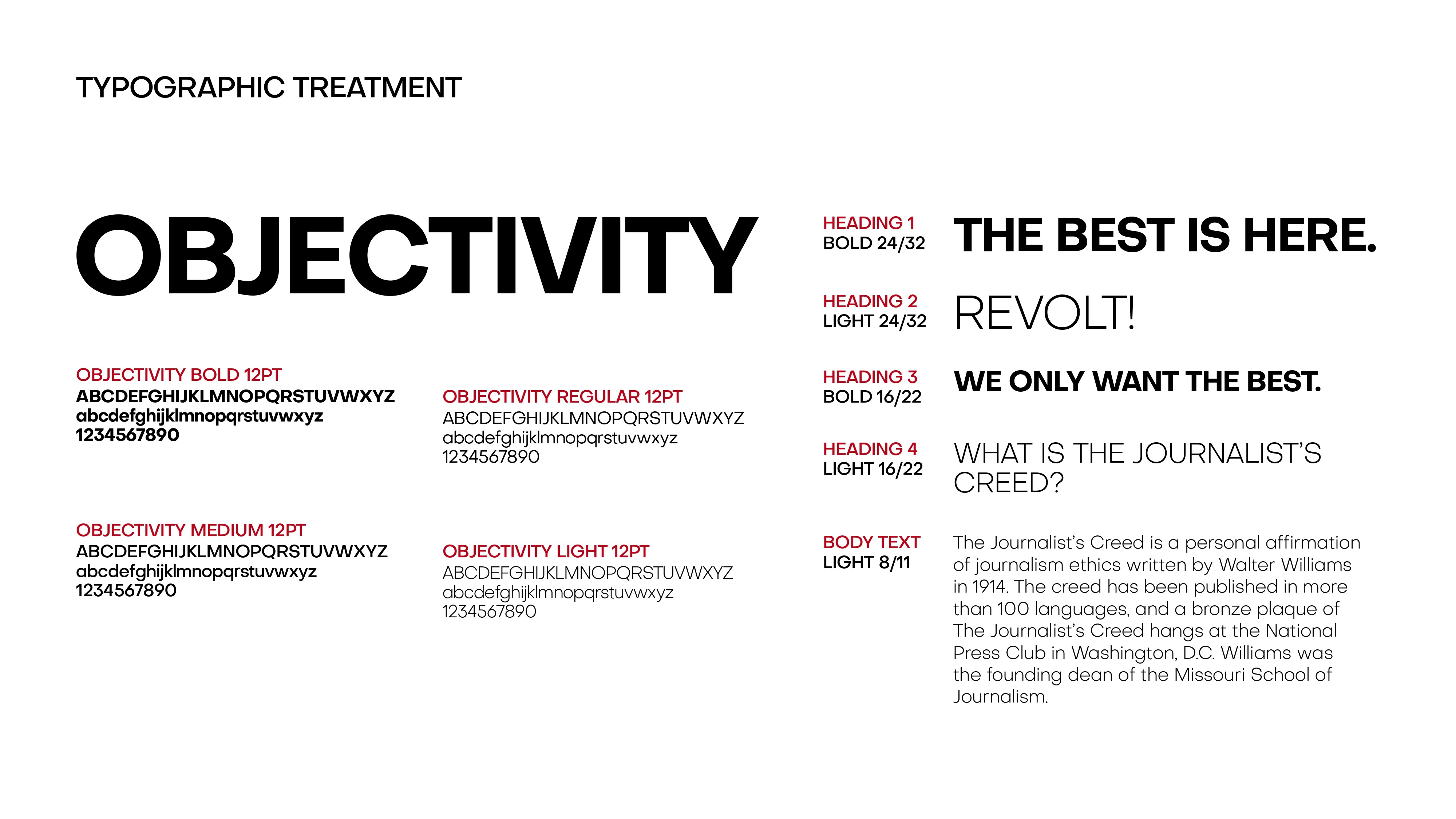
Typography & Color: Applied a modern sans-serif typeface and a high-energy gradient palette to position the organization as a forward-thinking leader in campus journalism.

Let's talk

Time for me:

Manila time displayed

Email:

hello.biencarlo@gmail.com

Reach out:

Bien Carlo Reyes

© Copyright 2025

Let's talk

Time for me:

Manila time displayed

Email:

hello.biencarlo@gmail.com

Reach out:

Bien Carlo Reyes

© Copyright 2025